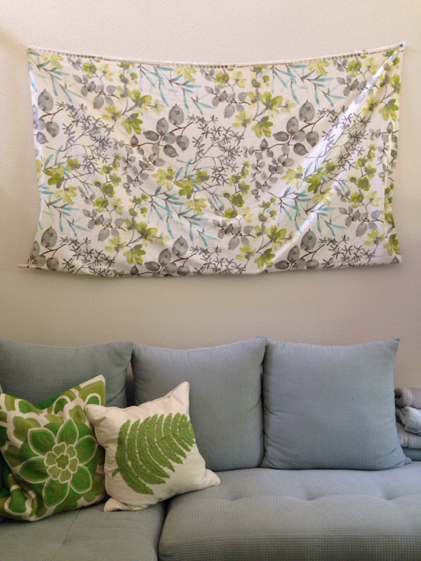
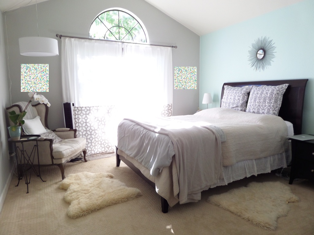
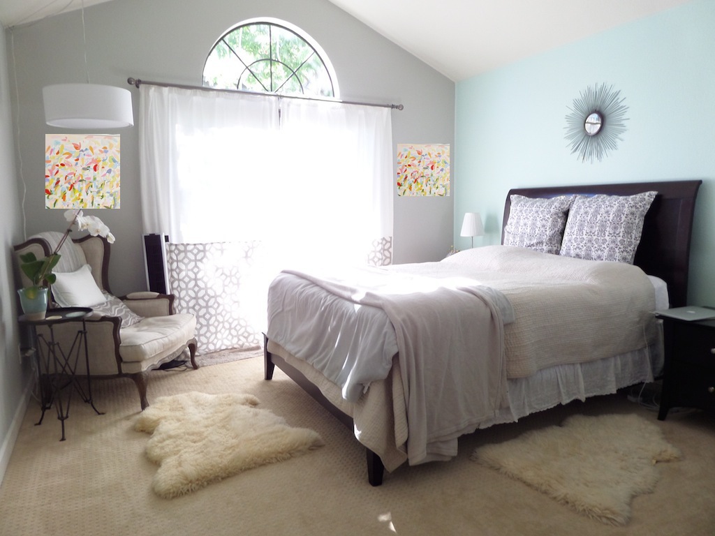
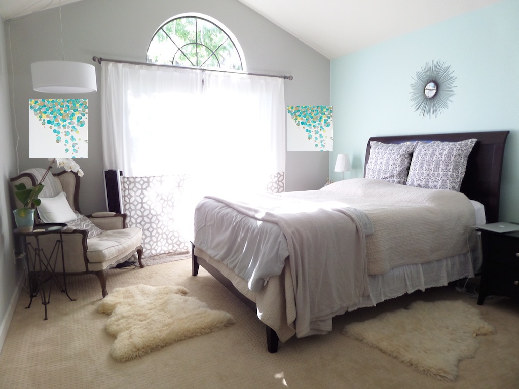
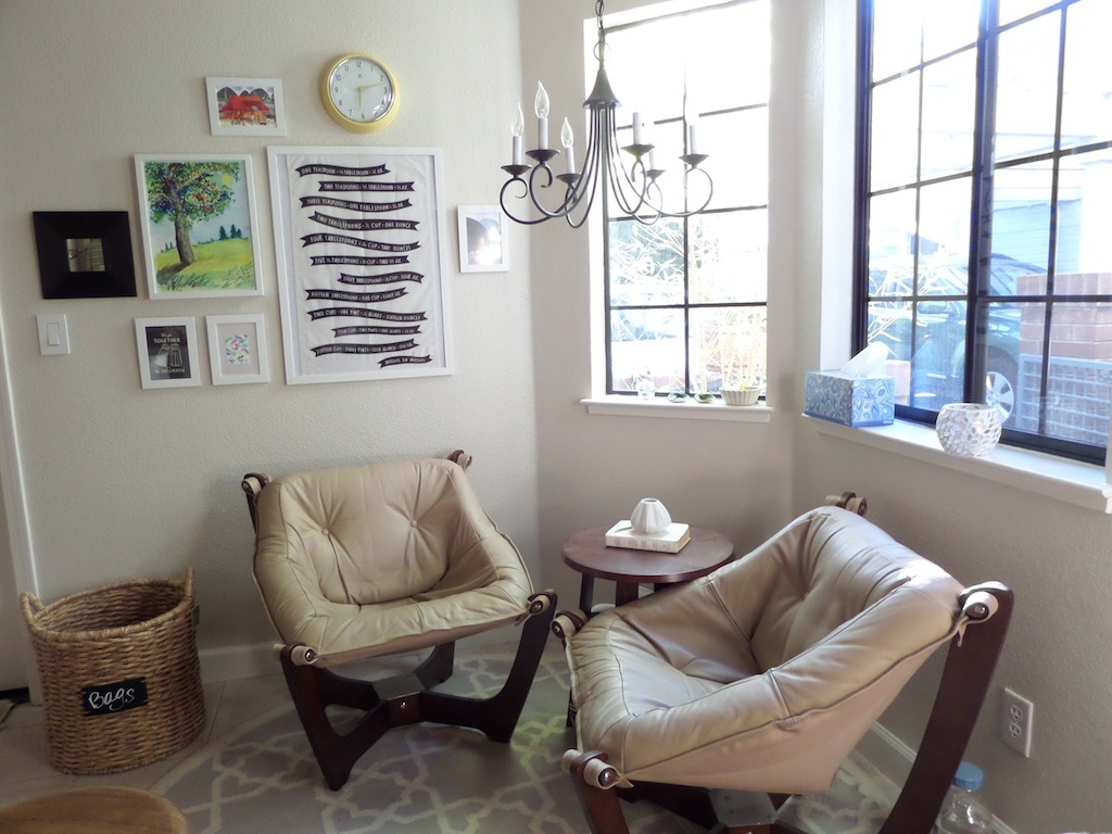
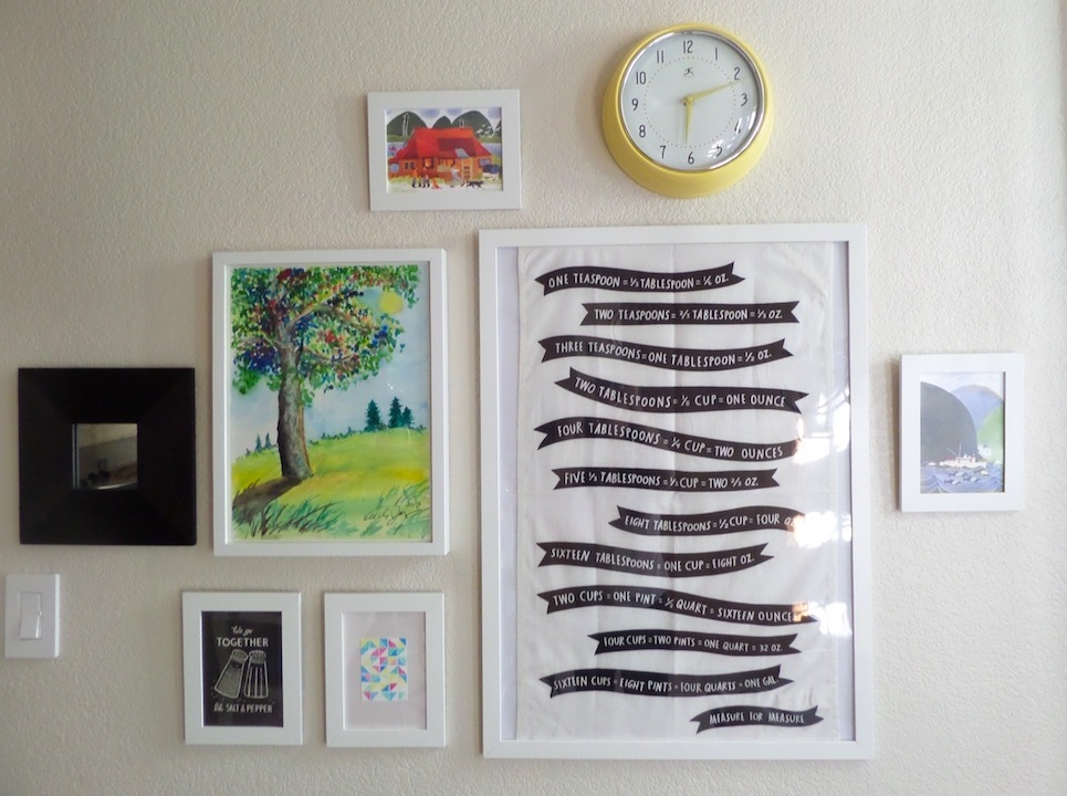
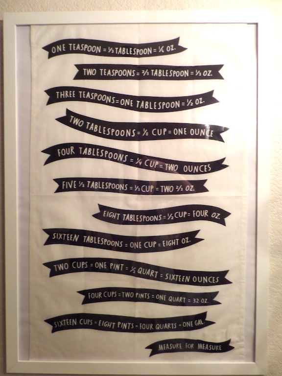
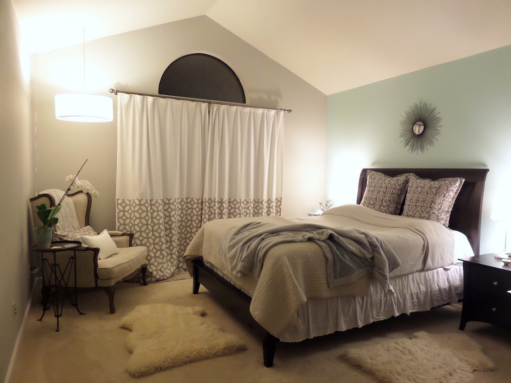
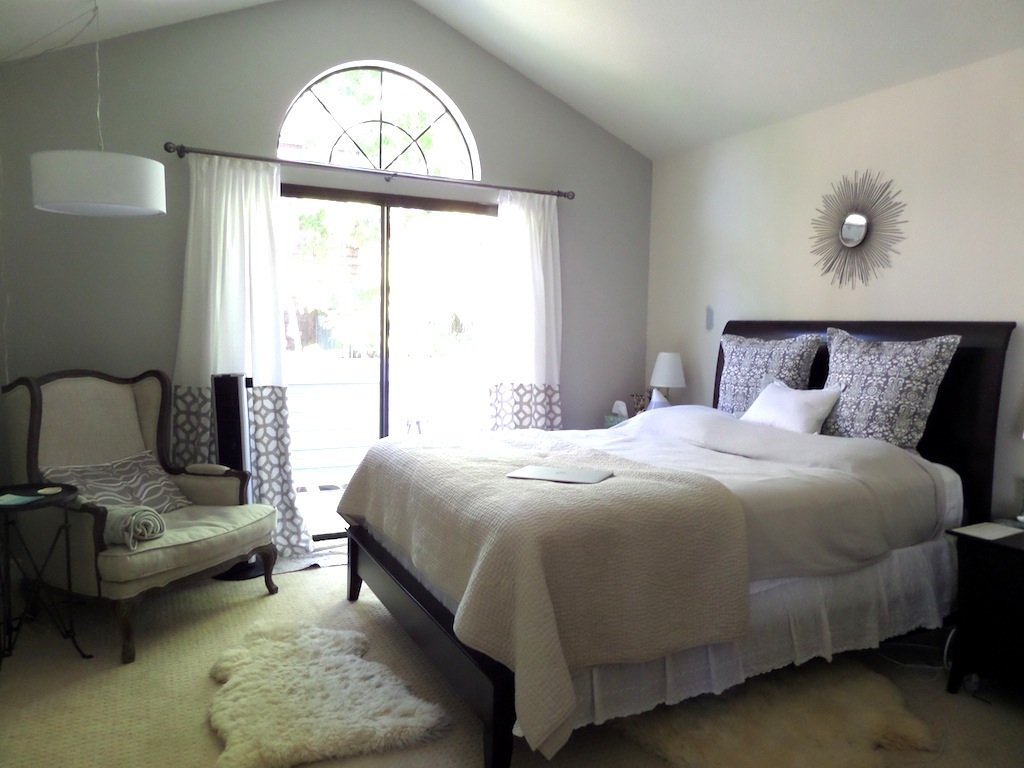
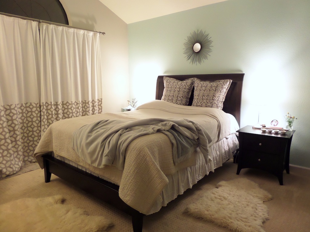
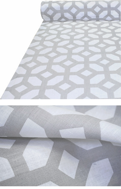
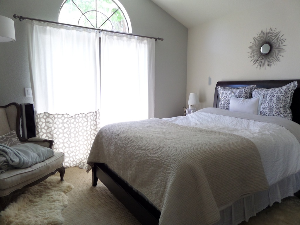
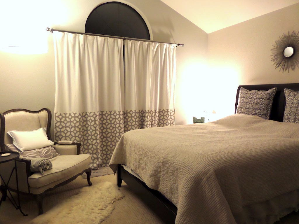
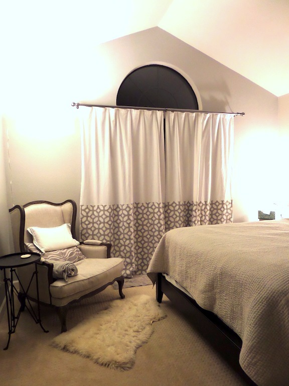
Two years ago I bought this fabric and pinned it up "temporarily" above our living room sofa. Apparently, nothing moves fast around here. :) Someone even asked once if we were hiding some scratch marks behind that fabric. #stylefail 
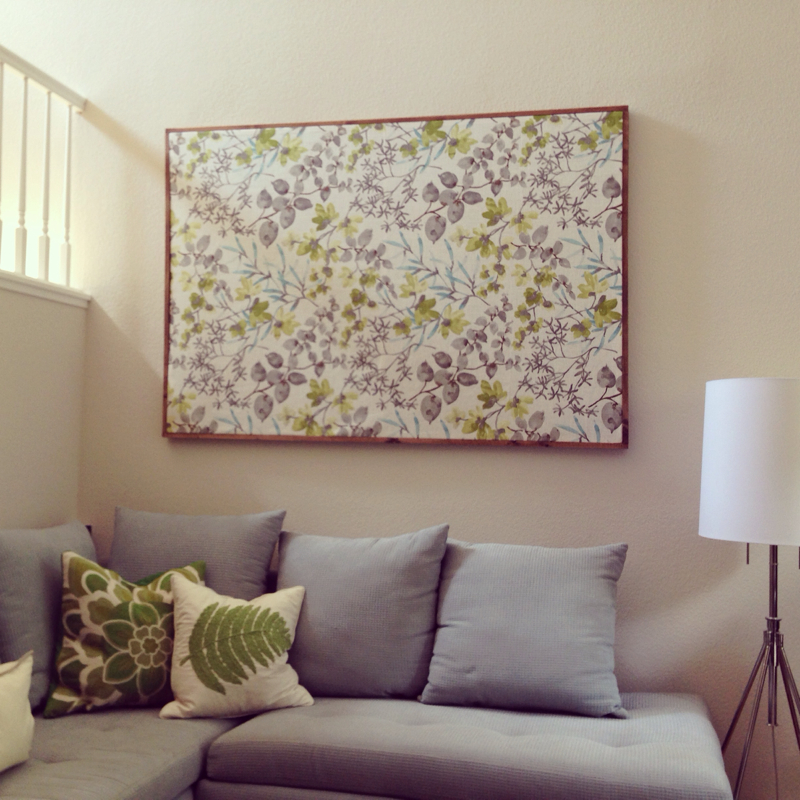
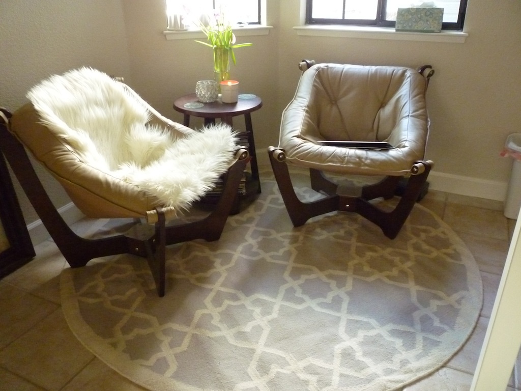
Well, no more! David and I built a stretch canvas frame and an outside frame for the fabric using our new toy, the Kreg Jig. 
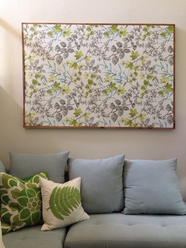
Turned out pretty well for a first wood project, if I do say so myself. We actually planned the project, got all the materials and built it on the same day. It's always nice to check something off the list when it's been there for two years. :)
0 Comments
There are so many things on my mind right now, and I'm feeling a bit overwhelmed. So, let's talk about something completely inconsequential: art for the master bedroom. So this is what our bedroom looks like now (if we make the bed). My first inspiration is from this beautiful room. I've always loved that large-scale abstract black & white painting. In our bedroom though, it looks like a poor zebra has been cut in half. Sad. Then I found this interesting DIY painting. It's definitely smaller in scale and is basically a smattering of colors. I kind of like this one better. It fits into the background and maintains the calm. Then just for kicks, I was wondering what it'll look like with warmer colors. Would it liven the room and bring a dimension to it? Hmm, it looks out of place here since it's the only thing in the room with warm colors. So I went back to a cooler color and found this painting. It's a bit more interesting than just the splattering of color. And this looks totally DIY-able. But by now, I was appreciating our blank walls more and more. Maybe less is more? What do you guys think?
When we bought the house, this area next to the kitchen was a breakfast area. It had a dining table and four chairs. Since it's just the two of us, we didn't feel the need to have another dedicated dining area. Instead, I dreamt of having a cafe / sitting area. Somewhere comfortable to plop down, drink coffee/tea, and read magazines. Here is our cafe two years ago. We fell in love with the the Luna chairs from Scandinavian Designs so that's our starting point. They were just incredibly comfortable and I liked the airy look about them. We then got a chandelier on CL and put it up. Then I realized my first rug choice (a 5' outdoor rug) wasn't that great of a choice. The size (too small), color (too matchy-matchy) and pattern (too tiki) were just wrong for this space. So I finally took the plunge on this 6' rug when I saw it on Joss & Main. Much better choice in my opinion. It made the space a bit more modern and sophisticated. And it felt more relaxed, like there was more space. So then I turned my attention to the wall. We had hung a painting there before (it was a gift) but just didn't look right so I took it down. And we were left with this blank canvas. (Don't mind the ceiling...it still needs to be drywalled. And yes, I may still be saying that next year.) And here's what I did for the wall. Yup, I added another collage. I've done a few collage walls now and this one may be my favorite because the pieces are a bit more personal. The anchor piece In the middle is a tea towel from West Elm that I framed. It has handy unit conversions. Great for baking! Above it is a new clock picked up from Target. To the left of the tea towel is an original watercolor by David's dad. He painted it a few weeks ago when he visited us. I love the colors and how it brings this space to life! And who else can say they have an original watercolor from a parent, right? Super cool. Below the watercolor painting is a cute card I picked up at Anthropologie. Appropriate for the kitchen area, no? The piece next to it is an original watercolor by yours truly. The remaining two prints are cards bought from our recent trip to Alaska by Rie Munoz. I love her style and the colors she uses. The last item in the collage is a little mirror from Ikea. It serves as a handy check before heading out the door. So that's a tour of our brand new happy little wall. I'm not going to call this space done yet but it has evolved into something that's more "us".
I finally got around checking off little things I've been meaning to do around the house. We hung this row of accordion hooks near the entry so now there is finally a place to drop off jackets and things like that. Handy for when we have guests over, too. Sorry for the terrible lighting (I really should take pictures with daylight), but I hung the "d" stencil on David's side of the bed... ...and the "j" one on my side. :) Love how these personalize our space. I got this tea towel from West Elm when it was on clearance and hung it in an Ikea frame. It's hanging out in the cafe, which is perfect because now I can see the unit conversions when I'm cooking in the kitchen. :) The cosmos are blooming like crazy now so I figured why not snip a few to enjoy inside? It's funny that they're all the same shade of pink because the seed packet I got was supposed to be a various shades of pinks/reds. :) I love the pink against the white. So that's a few things that finally got done in our house. I've still got a garage to clean -- yes, I haven't forgotten about that. *sigh.
I found yet another project for my little bottle of Martha Stewart craft gold paint! This has been such a good investment. I probably should've taken a "before" picture, but the mirror in our bedroom was oil-rubbed bronze before. Now it's girly glam gold with a hint of oil-rubbed bronze. :)
I was too lazy to make the bed this morning to take day photos so these photos from last night will have to do. We finally put everything back in its place after the paint job and I'm happy to call this bedroom done! Here's what it looked like before the blue accent wall. Honestly, I'm just glad to have gotten rid of the gray paint swatch above the lamp. That was an "oops" moment for me when I was testing gray paints. I had forgotten that we weren't painting that wall so yea, oops. And to be perfectly honest, I'm still getting used to the blue. I think it was everything I had hoped -- it's a happy, minty blue that isn't too muted or too "nursery". But somehow I am just startled by the burst of color and I start to think, "Should we have gone with a much paler and softer blue instead?" Anyone else always has second thoughts after painting? I do think it's very pretty, though. I'm thinking about giving the mirror a little bit of gold. I think it'll make it look very glam in here. And here is my nightstand with the nice blue background. I love all the little things on the nightstand. The photo is the two of us in Monet's Garden last year. The flowers are from our garden. I just love the wiener dog that is holding the color pencils. Somehow I've also found its neck to be useful for corralling all my loose hair ties. Poor doggie. And of course, the set of stacking bowls I got from West Elm recently. And lastly, this has nothing to do with the blue accent wall but our orchid next to the chair is blooming again. :) 6/28 Update: Thanks to David for making the bed this morning :)
I'm always surprised, shocked really, after seeing a wall in a new paint color. Then I get a pit in my stomach, "Did I pick the wrong paint color? Oh no, I really hope we're not repainting."
We started painting on Sunday night and stopped three-quarters of the way because we ran out of paint (we only bought one pint). After seeing the minty blue on the walls for the first time, I had serious doubts about my color choice. It just felt too bright to me. "I should've tested the color on the wall before committing," I lamented. David comforted me saying the paint is still drying so we should wait until it dries to see the actual color. Love my level-headed husband. Last night we dropped by Lowe's to pick up another pint of paint and finished the job. I woke up this morning and took these pictures and felt like the color was definitely not muted in any way, but it is somehow calming and peaceful. We'll see what it looks like in the evening. I'm crossing my fingers. So about a month ago, I mentioned we were going to give our bedroom an accent wall. I knew I wanted a happy and calm minty blue and got a collection of paint chips from Lowe's. Then a few Sundays ago we went to Bistro Maxine in Palo Alto for crepes and ended up stopping by West Elm. And I saw these pretty little bowls. The bowls are just beautiful and we handed over the nine-bucks and brought them home. I actually think they look better in real life if that's possible. But what struck me was the color palette -- gray, beige and a minty blue! Basically the color palette of our bedroom! The following picture of the larger bowls probably shows the color better. When we got home, I held up some of the paint chips against the pretty minty blue bowl and decided on Valspar's Mint Whisper. We got the paint already and now it's just a matter of picking a night to do it. Hopefully Spurs win today and I can paint on Thursday. :)
I hope I didn't scare my husband with the title of this post! No, we're not painting over the beautiful and perfect Dolfin Fin gray. That's staying. What I'm talking about is the wall where our bed is. Yup, the one with a gray paint swatch on it since...ooh I don't know, half a year ago? Our master bedroom has been difficult for me to get right. Here's what it looked like when we moved in. You know, it wasn't bad. I just wanted something lighter and more calming. And I think we are slowly moving in that direction. At this stage, I think it's a blank slate ready for a statement color. So I'm thinking of going back to an idea of the 90s and painting an accent wall blue. I kind of want a seafoamy, minty, coastal, happy blue. Not a moody or royal blue. But I also don't want it to be too bright and young either because this is not a nursery, it's our bedroom. I think I know what I want, but picking paint colors is really hard for me. I guess that's why paint testers exist. Don't you think a beautiful blue/mint would look so pretty as a backdrop to the nightstands? I think so. I think it'll really liven up the room and give it a personality and the room will feel more...finished. :)
A while ago I came across this beautiful fabric. And I just loved it so I bought a yard of it. The fabric is 100% linen so it is very breezy and has a great texture. I was thinking the pattern would be great (in size, scale and color) with the master bedroom so I pinned the yard of fabric on our white Ikea Lenda curtains to see how it looked. And I loved it! So I bought another yard of the fabric for the other curtain and tonight I finally sewed them onto the curtains. The real colors are more like the above pictures. I'm pretty proud of myself for getting this done because it was a lot of fabric going through the sewing machine! And I can't believe the two bands ended up looking pretty straight. What do you think? Do you like the banded version better or the pure white curtains before?
Anyway, I'll take some daylight pictures another day to show the colors but I am loving this little change in the bedroom. In general, I'm moving towards a linen beige + blue + gray color for the bedroom. I find that color combo to be very calming and relaxing. :) |
Archives
March 2015
Categories
All
Current ProjectReupholstering & Tufting 2 Benches |